Your Fuel Economy Display Is Doing Math — Just Not the Math You Think
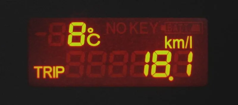
Photo: Qurren, CC BY-SA 3.0, via Wikimedia Commons
The Number That Feels Official
Modern dashboards have made fuel economy feel like a precision measurement. You glance at the display, see 34 mpg, and feel like you're doing well. The number updates constantly. It responds to how you drive. It feels like a live readout of your car's actual performance.
It's not. Or at least, it's not in the way most drivers assume. The fuel economy figure on your instrument cluster is a calculated estimate based on a specific set of inputs — and those inputs have some important limitations that the display doesn't advertise.
Understanding how that number is actually generated changes how useful it is.
How the Calculation Works
Your car doesn't have a sensor that directly measures fuel flow the way a gas pump does. Instead, the engine control unit — the computer managing your engine — tracks how long the fuel injectors are open and how many times they fire. From that, it calculates an estimated fuel delivery rate. Divide your speed (from the wheel speed sensors) by that estimated fuel rate, and you get a miles-per-gallon figure.
This happens continuously, which is why the display updates in real time. It's genuinely responsive to your driving — ease off the throttle and the number climbs; accelerate hard and it drops. That responsiveness is what makes it feel accurate.
But the calculation is built on estimates, not direct measurements. And those estimates carry assumptions that don't always match real-world conditions.
Where the Optimism Creeps In
The injector timing model your car uses was calibrated under specific conditions — typically using fuel with a defined energy content. Real gasoline varies. The ethanol blend in your tank (most US gasoline contains up to 10% ethanol) has less energy per gallon than pure gasoline. Your car's computer may not fully account for this variation, which means it can overestimate how far each gallon is actually taking you.
Fuel pressure also matters. Injectors deliver slightly different volumes depending on fuel system pressure, which fluctuates based on temperature, pump wear, and other factors. The computer uses a model, not a direct measurement, so small errors accumulate over time.
There's also a timing issue. The instant-MPG display reacts to what's happening right now, but short-term averages can be skewed by recent driving context. If you just finished a long downhill stretch where the engine was barely working, your average looks great — even if the next ten miles involve a lot of stop-and-go.
Why It Almost Always Reads High
Studies comparing dashboard fuel economy displays to actual measured consumption — calculated the old-fashioned way by tracking gallons pumped versus miles driven — consistently find that the display reads optimistically. The gap isn't enormous, typically somewhere between 2% and 6% on average, but it's directionally consistent: the dashboard almost always makes your car look slightly better than it is.
There are a few reasons this skews optimistic rather than pessimistic. One is that the calculation doesn't account for fuel used during engine-off periods or parasitic draws from accessories. Another is that the injector model is calibrated to a baseline that doesn't perfectly reflect every real-world condition. The errors tend to compound in one direction.
The EPA's own research has found this pattern across vehicle types, which is part of why real-world fuel economy so often falls short of both the window sticker and the dashboard display.
What the Display Is Actually Good For
None of this means the fuel economy display is useless. It's a genuinely valuable tool when you understand what it's measuring.
The display is excellent for relative comparisons. If your usual highway commute shows 36 mpg and it suddenly drops to 30 for no obvious reason, that's a meaningful signal — something may have changed with your vehicle, your tires, or your driving patterns. The display is tracking the same calculation consistently, so changes in the number are real even if the absolute value is slightly off.
It's also useful for real-time feedback on driving behavior. Watching the instant-MPG readout while you accelerate and brake teaches you a lot about how your habits affect efficiency. That's the feature working as intended.
For actual fuel cost planning, though, the dashboard number isn't your best source. The most accurate way to calculate your real-world fuel economy is still the manual method: reset your trip odometer every time you fill up, and divide the miles driven by the gallons it took to refill. Do that a few times and you'll have a much more grounded picture of what your car actually costs to run.
The Gap Between the Display and the EPA Sticker
It's worth separating two different numbers that drivers often conflate: the dashboard display and the EPA fuel economy estimate on the window sticker.
The EPA number is a standardized lab result — useful for comparing vehicles to each other, but not a prediction of what you'll see on your commute. The dashboard number is a real-time calculation based on your actual driving — more responsive to conditions, but carrying its own measurement limitations.
Neither one is lying to you. They're just measuring different things. The dashboard is calculating fuel delivery estimates against wheel speed. The EPA is running a standardized test cycle that doesn't match any real road. Your actual fuel economy is somewhere in the vicinity of both — and probably a bit lower than either suggests.
The Takeaway
The fuel economy display on your dashboard is a useful tool that's doing genuine math in real time. But it's estimating fuel delivery, not measuring it — and those estimates tend to paint a slightly rosier picture than reality. Use it for trend-watching and driving feedback. For actual numbers, fill the tank and do the division yourself. The result might be a little humbling, but it's the number that's actually true.
